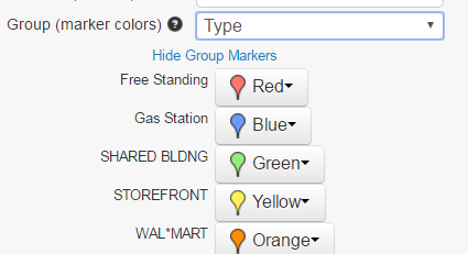
The colors are automatically assigned based on the column you set as the Group (see image below). There are up to 20 different colors that are used for premium/pro users and 7 for free. If a column has more than 20 (7 for free maps) unique values, they will be combined together in ranges. It’s best to define the range yourself and use that for the group.
Assign a group to change the pin colors:

After assigning a group the colors can be changed as shown in the above image by clicking on ‘Show Group Markers‘ (becomes ‘Hide Group Markers’ after clicking).
A video to demo changing marker pin colors
A very real life situation is as follows:
In order to assign different pin colors to two spreadsheets, one with sales reps and the other with potential customers. The spreadsheets need to be combined into 1 and a column (possibly ‘sales type’) needs to be added. The values for the column can be ‘sales rep’ and ‘customers’.
Sample Transforming Zip Code data for multiple colors
In order to add 3 different colors to the map for the following zip codes in the table:
| Sales Rep1 Zip Codes | Target Zip Codes | Future Zip Codes |
|---|---|---|
| 30546 | 30553 | 30557 |
| 30547 | 30554 | 30558 |
| 30548 | 30555 | 30559 |
| 30549 | ||
| 30552 |
The data needs to be transformed into the following to get 3 different colors based on the zip code type:
| Zip code | Type |
|---|---|
| 30546 | Sales Rep1 Zip Codes |
| 30547 | Sales Rep1 Zip Codes |
| 30548 | Sales Rep1 Zip Codes |
| 30549 | Sales Rep1 Zip Codes |
| 30552 | Sales Rep1 Zip Codes |
| 30553 | Target Zip Codes |
| 30554 | Target Zip Codes |
| 30555 | Target Zip Codes |
| 30557 | Future Zip Codes |
| 30558 | Future Zip Codes |
| 30559 | Future Zip Codes |
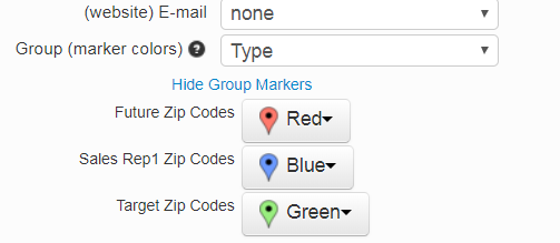
The resulting color options will appear
