Clustering: Combine dense markers on a map
Clustering on Google Maps refers to combining nearby markers together to form one new marker with a number (generally the number of pins) to indicate the density of locations for a certain zoom level. The new marker is either a pie chart to indicate the types of markers that form it or a single color to represent all the markers are the same type. The type of marker is defined by the data; one color could represent the type of restaurant (such as: burgers, tacos, pizza, etc).
EasyMapMaker uses grid based clustering with the position of the cluster located at the average position of the pins in the cluster. This means two clusters can overlap if there is a high density of pins near each other.
Clustering is automatically enabled when there are more than 150 pins, but this option can be disabled.
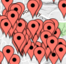
Separated Pins vs Clustering
Benefits of Clustering
Clustering allows maps with thousands of pins to load really fast. In many cases maps with over 10,000 pins without clustering will have significant performance issues due to the resources dedicated to each pin. Our clustering engine allows for up to 100,000 pins on the map with reasonable performance. The clustering engine used by EasyMapMaker is a modified version of Google's MarkerClusterer.
Pie Charts with Clustering
Pie charts are used for clustering when the Group (marker colors) drop down is set to a value (see how to set pin colors). The colors and proportions of the colors in the pie chart are based on the number of pins in the cluster with the given color.
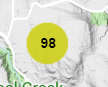
Cluster display value
The default display value for cluster pin is the number (count) of pins in the cluster. However, this value can be changed to another value based on the data. It can be one of the following: sum, minimum, maximum, or average of a numerical value from the imported spreadsheet (the cluster column drop down). Setting the cluster value can provide a different perspective on the density of data in the cluster.
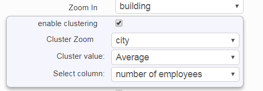
Cluster Zoom
The cluster zoom level is the zoom level where the clustering shows individual pins instead of clusters. The default value is the city level, but the range is anywhere from state down to details of a town. If there are a lot pins in a small area then it is a good idea to keep the value closer to "town detailed". If pins are all over the world then a more appropriate value would be the "state"Cluster Zoom & Cluster value
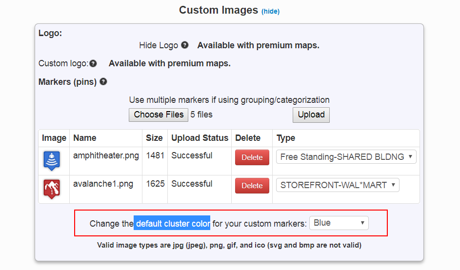
Cluster Color with Custom Pins
The clustering color defaults to red when custom pins are used. However, the cluster color can be changed to one of 20 different colors. When using custom pins, pie charts are disabled and single color is used for the cluster circle.Cluster Color for custom pins
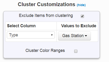
Excluding Pins From Clustering
When clustering is enabled all pins will appear in a cluster when they are close enough to other pins. There is an option to exclude certain types of pins based on their value(s) in a given column in the imported spreadsheet.To Exclude pins from clustering, do the the following:
- Click Show Advanced Options
- Click the show link next to Cluster Customizations
- Check the box next to "Exclude Items from clustering"
- Select a column from the 'Select Column' drop down
- Select one or more values to exclude from the cluster
Exclude from clustering settings
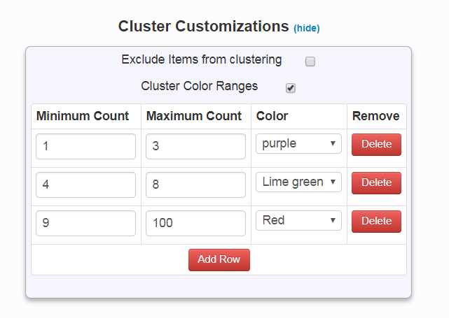
Cluster Color based on Pin Count
The color of the cluster can be set based on the number of pins in a cluster. This is an advanced option.To add cluster colors, follow the steps:
- Click Show Advanced Options
- Click the show link next to Cluster Customizations
- Check the box next to "Cluster Color Ranges"
- Click add row
- Type in a minimum and maximum value (representing pin count) then select a color.
Cluster Color Range settings